How to Balance Warmth and Minimalism in Exterior Design
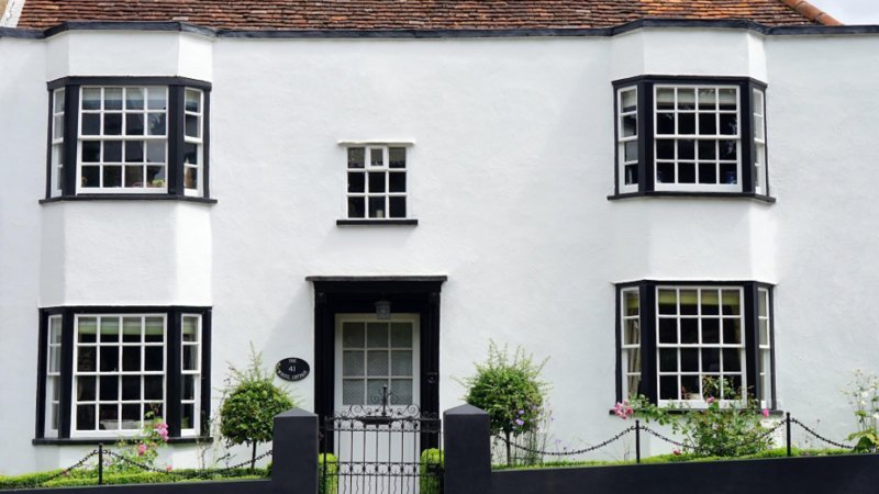
Minimalist exterior design is often admired for its calm, clean, and ordered appearance. It removes unnecessary visual noise and allows architecture, proportion, texture, and light to become the main features. Yet a home can lose its sense of welcome when minimalism becomes too bare. A front entry may look refined from the street but feel cold up close if there is no warmth, softness, or personal detail to balance the restraint.
The most successful modern exteriors do not choose between simplicity and hospitality. They combine both. A warm minimalist entry uses fewer elements, but each element is selected carefully. Materials feel honest, lighting feels soft, colors feel controlled, and decorative accents serve a purpose. The result is an exterior that feels composed without becoming severe, edited without feeling empty, and modern without losing the human quality that makes a home feel approachable.
Warmth Begins With Restraint, Not Excess
Adding warmth to a minimalist exterior does not mean filling the porch with décor. Too many accessories can weaken the clarity that makes modern design appealing in the first place. Instead, warmth should come through texture, proportion, tone, and intentional focal points. A wood door, a soft wall light, a natural planter, or a simple greeting detail can shift the entire mood of an entry without cluttering the façade.
Minimalism works best when it feels deliberate. Empty space should frame important features rather than make the entrance feel unfinished. The space around a front door, for example, can give a sign, planter, mailbox, or light fixture more presence. When decorative elements have breathing room, they feel architectural rather than ornamental. This is the quiet trick of warm minimalism: it lets fewer details carry more meaning.
What Decorative Element Adds Warmth to a Modern Entryway?
Contemporary exterior design often relies on clean lines, restrained color palettes, and carefully selected architectural details. Those characteristics create visual clarity, but they can also leave an entryway feeling impersonal when decorative elements are reduced too aggressively. Homeowners looking to preserve a minimalist aesthetic while introducing a more approachable atmosphere often need a focal point that communicates hospitality without disrupting the overall design language. In many modern entrances, modern welcome signs achieve that balance by combining a welcoming message with the simplicity and structure associated with contemporary décor.
A successful modern entryway uses intentional design choices rather than large numbers of decorative accessories. Modern welcome signs contribute warmth through typography, material selection, and placement while maintaining the clean appearance expected in contemporary spaces. Their visual presence helps soften hard architectural surfaces and creates a more inviting transition between the exterior environment and the home’s interior.
The effect extends beyond decoration. A greeting display establishes a tone for visitors before any interaction occurs. That message supports the broader purpose of an entrance, which is to make guests feel comfortable while reinforcing the personality of the home. Modern welcome signs accomplish this without introducing visual clutter because their design typically aligns with minimalist principles such as balance, simplicity, and purposeful placement.
When coordinated with exterior lighting, planters, and front-door hardware, a modern greeting sign becomes part of a cohesive design system. The result is an entryway that remains contemporary while feeling noticeably more welcoming, approachable, and complete.
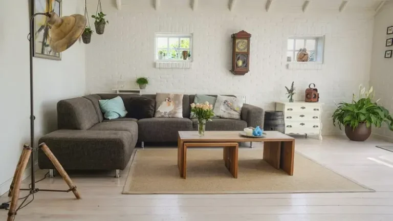
Use Materials to Soften the Architecture
Modern exteriors often feature hard surfaces such as concrete, metal, glass, stone, brick, or smooth siding. These materials can create a strong architectural presence, but they may need softer accents to keep the entry from feeling too rigid. Natural wood, woven textures, matte finishes, warm metals, ceramic planters, and greenery all add a sense of comfort while preserving a clean appearance.
The same principle applies to connected interior and exterior design decisions. A home feels more unified when the front entry reflects the style language carried inside. Homeowners considering modern finishes can take inspiration from current interior door style trends, especially because door profiles, hardware finishes, and material choices often influence how the exterior entrance is perceived. A simple exterior entry feels more complete when it hints at the home’s interior character.
Choose One Warm Material as the Lead Accent
A minimalist exterior becomes easier to balance when one warm material leads the design. This could be a wood door, a natural-toned planter, a bronze fixture, or a warm sign finish. Using one primary accent prevents the exterior from feeling scattered. The other details should support that material through similar undertones or simple contrast. This gives the entry warmth without visual confusion.
Let Lighting Create Atmosphere Without Visual Clutter
Lighting is one of the most effective ways to soften a minimalist exterior. A simple fixture can add depth, shadow, and warmth without introducing extra objects. The shape should remain clean, but the light itself should feel welcoming. Warm white illumination near the door, steps, address area, or porch wall can make the entrance feel safer and more inviting after sunset.
Scale is important. A light fixture that is too small may make the entry look unfinished, while a fixture that is too ornate may interrupt the minimalist language. The best choice is often a simple wall sconce, downlight, or linear fixture that adds clarity to the entry. Good lighting should reveal important features rather than overpower them. It should help visitors understand where to go while giving the façade a softer evening presence.
Coordinate Mailbox, Hardware, and Entry Details
Minimalist exterior design depends heavily on coordination. Small features become more noticeable because there are fewer distractions. A mailbox, door handle, house number, planter, and greeting sign should feel like they belong to the same design family. They do not need to match exactly, but their shapes, finishes, and scale should feel related.
A mailbox is a good example of a practical object that can either support or weaken the exterior composition. Homeowners looking for inspiration can review creative mailbox design ideas to see how color, material, and form influence curb appeal. In a warm minimalist setting, the mailbox should feel clean and intentional while still adding a small note of personality to the property’s street-facing edge.
Avoid Mixing Too Many Design Languages
A minimalist entry can lose its strength when modern, rustic, farmhouse, traditional, and industrial elements are all used at once. One rustic sign, one ultra-modern light, one ornate handle, and one decorative mailbox can create visual friction. A better approach is to choose a primary direction and allow small variations within that direction. Warmth should come from tone and texture, not from a crowd of competing styles.
Use Plants as Living Softness
Plants are one of the easiest ways to add warmth without compromising minimalism. A single sculptural planter, a pair of matching pots, or simple greenery near the entrance can soften hard surfaces and add life to a controlled exterior palette. The goal is not to create a crowded garden at the door. It is to introduce an organic shape that balances straight architectural lines.
Plant selection should match the home’s climate, light exposure, and maintenance routine. Evergreen plants can provide structure throughout the year, while seasonal flowers can add controlled color. In minimalist design, containers matter as much as the plants themselves. Clean-lined pots in stone, ceramic, concrete, or metal finishes can support the architecture while giving the entry a more welcoming tone.
Brand Section: A Simple Greeting With Modern Character
A modern greeting sign can play an important role in a restrained exterior because it introduces hospitality without requiring heavy decoration. Its message is simple, but its design effect can be significant. Typography, scale, finish, and placement allow the sign to feel integrated with the entrance rather than added as an afterthought. In a minimalist setting, that kind of clarity matters.
The strongest designs use clean lettering, balanced spacing, durable materials, and a placement that supports the front door rather than competing with it. A sign may stand vertically beside the entry, sit within a porch arrangement, or work with planters and lighting as part of a compact focal point. When chosen carefully, it brings warmth, identity, and a more personal tone to an otherwise restrained exterior.
Edit the Entry Before Adding More
One of the most useful steps in warm minimalist design is editing. Before adding new décor, homeowners should remove items that no longer support the exterior. Faded mats, mismatched pots, extra signs, old lanterns, broken planters, and unnecessary accessories can make the entry feel cluttered even if each item is small. Removing visual noise gives the best details more room to work.
After editing, the entry can be rebuilt with purpose. One greeting element, one or two planters, one strong light fixture, and coordinated hardware may be enough. Warmth comes from the quality of the choices, not the quantity. A restrained entry can still feel deeply inviting when every detail feels considered.
Conclusion
Balancing warmth and minimalism in exterior design requires careful control. The goal is not to strip the entry until it feels empty or decorate it until the architecture disappears. The goal is to choose details that soften, guide, and personalize the space while preserving clean lines and visual calm. Materials, lighting, plants, hardware, mailbox design, and greeting details all contribute to that balance.
A warm minimalist exterior feels composed from the street and welcoming at the door. It uses fewer elements, but each one has a clear role. When a modern entry combines simplicity with hospitality, it becomes more than a polished façade. It becomes a thoughtful arrival experience that feels calm, current, and genuinely inviting.